Flux your grab & ride journey planner

FLUX

UX Case Study

Flux

Lead UX Designer

I was assigned to lead the design team for Flux’s concept in both UI and UX in this project.  I collaborated with a product manager, dev and design team to research, plan and execute.

Platforms

iOS
Android

⚠️ Note: As to comply with my non-disclosure agreement, confidential information has been omitted in this case study. Pseudo name has been used across the case study.

The Challenge

*Flux is a pseudo name I’ve given instead of the real company due to my contract restriction.

Flux is a traditional cab booking company that looking for a revamp for their current app.

Due to intense competition and their current app quality, they have a very high churn rate in their user base. Besides that, they also receive a lot of negative reviews.

Hence, our client is looking for someone to redesign their existing platform.

Design Process

Empathise Phase

I have always started my design journey by having meetings with my stakeholders to understand their business goals.

Then, I start my user research with user interviews with real users to find out their pain points and needs.

By understanding both business and users perspectives, I am able to define my priorities and goals.

Priorities & Goals

  1. To prioritise user’s needs in the platform.
  2. To simplify the user journey with intuitive design.
  3. Bring gamification into the platform.

Involvement

  • Stakeholder meetings
  • Requirement scoping
  • User Research & Interviews
  • Storyboarding, Wireframing & Prototyping
  • Design system

Design & Research Tool Kit

User Research

I have conducted three rounds of interviews with a group of four individually to define our main persona.

Users Interview

These are the questions, I’ve asked during the interview.

  1. How do you usually start your journey?
  2. Is it a round trip or multi-destination journey?
  3. If yes, why do you usually stop by before your last destination?
  4. How often do you commute on weekly basis?
  5. What kind of transportation do usually you take? (weekdays vs weekend)
  6. Do you always en route to have your errands done while on your way to work/school?
  7. Have you used app X?
  8. Can you describe the experience of the journey while using the services?
  9. Have drivers ever be late? How often?
  10. What are some of your frustration using the service?
  11. How often do you book a ride in advance?
  12. And how early in advance do you plan your journey ahead usually?

We started by compiling all the interview answers into cards and sorting them into groups to understand the problem better.

After consolidating our result from our survey and some interviews we conducted with our friends, we found some of the top mutual frustrations that were shared amongst the users. (In red, shows the opportunity can be resolved with better UI and UX design.)

Persona

1. Traveler

Quinn 22-35 years old

The common cab taker. She just wants to travel fast from place to place, and being able to book a ride within minutes with the best deal available. She usually plans her trip in advance.

2. The Spontaneous

Elise 18-25 years old

Always looking for places with amazing vibe and good deals. She is spontaneous and usually has impromptu plans. She travel by public transport on weekend, but sometimes take a cab when she’s late for her meeting.

3. Office Worker

Jake 32-45 years old

The white collar, usually has a fixed routine. From home to office, and office to home. He prefers to take public transport compared to cab. He sometimes likes to grab a coffee or shop for groceries. 

Then, I split to into 2 archetype of personas and list out all their goals and pain points to gain more insights of opportunities we have.

User Journey Map

After having enough understanding of our targetted users, I start creating a user journey map to understand deeper into their struggle when using the app as well as, inserting some features we visualised that might works.

Competitive Analysis

After going through the pain points, we start to compare each feasible opportunity with our competitors’. (based on Singapore’s market)

Based on my research, Grab actually has some of the features that we are pursuing. However, we did not manage to find that in app at the moment.

User Flow

Due to time constraint, we decided to combine the most important traits of the three personas into one ideal story and come out with a use case for designing the app. 

This user flow sums up the main flow as how users will interact with it from start-to-end, from cab booking to destination arrival, and finally, saving the journey.

For MVP, we decided to focus solely how the user journey flow. 

Wireframes

I started to create the wireframes as the outline for the app. Many revisions and iterations are done based on feedbacks from the stakeholders and team.

Flux's Experience

Search

For this function, I am inspired by how Google Map let you search for what you trying to do instead of the place.

The Planner

The planner allows users to flexibly plan and readjust their multi-destination journeys all in one place. Here is what it can do:

  1. You can tap on each items in your itinerary to select and modify the settings of the journey. 
    (The bottom drawer shows your ride options, drop off time, traveling time, price and preferred payment methods)
  2. Hold and drag to reorder the sequence of your journey.
  3. Swipe left to edit or remove your destination.
  4. Add an extra location anytime.
  5. Route preferences. (eg. Fastest or cheapest route, accessibility, etc.)
  6. Multiple transport mode. (Cab,MRT, Walking, etc.)
  7. Advanced booking.
  8. Save or share your journey with your friends.

Final Product

Design Philosophy

My design philosophy for this product is to be simple and accessible. So I came out with the “Drawer” design.

“ The drawer design is very simple and comfortable to interact with. ”

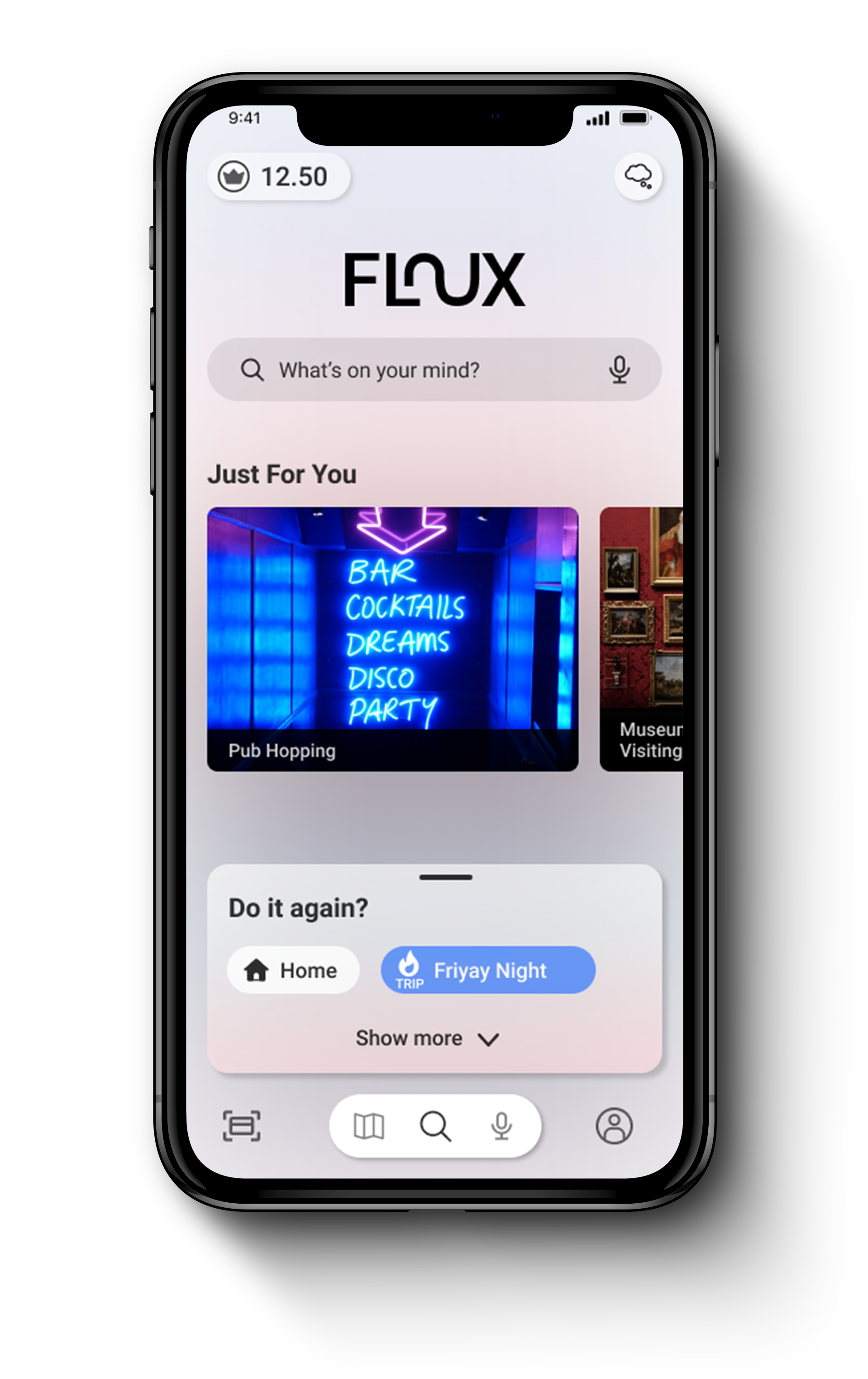
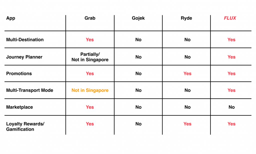
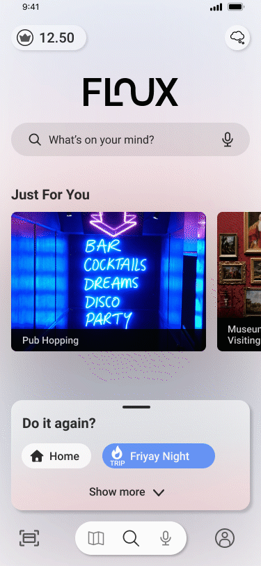
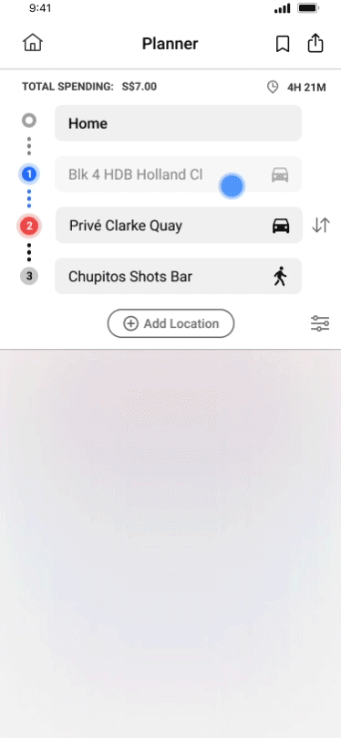
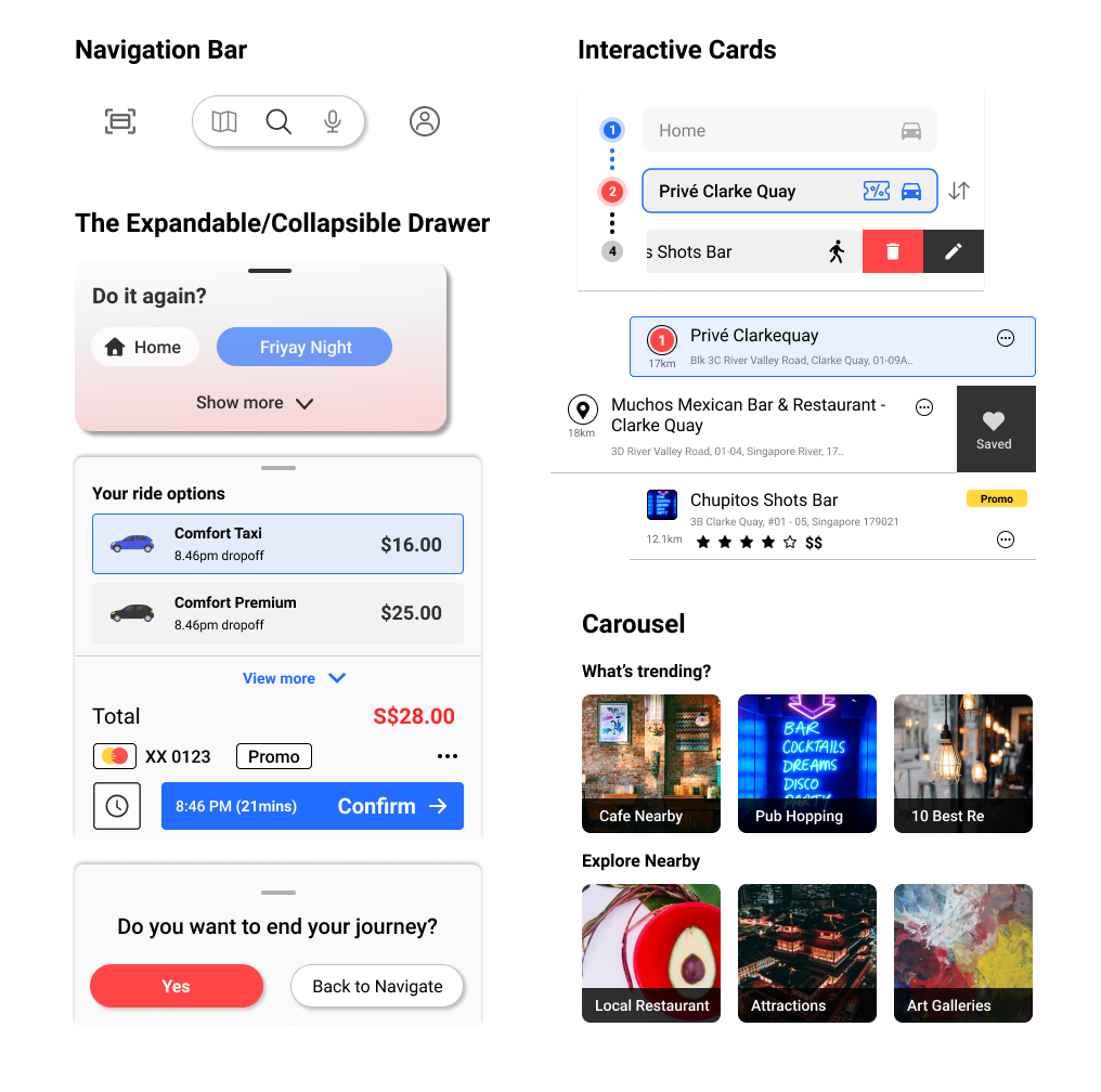
I believed that with us keeping all the essential CTA and information in the drawer within thumb reach, allows users to a decision in shorter time. 

In this project, I was deeply inspired by the google chrome design, where it always offers users a simplistic and clean interface to interact with. Especially from an article, I read, from google designer Hannah Lee.

Drawer design allows users to make decisions faster and more comfortably, as they do not have to move their thumb across the big fat screen.

Design Language

Flux’s design language is all about simplicity and beauty of shades and transparency. 

The focus of this design system is to make Flux to be 

Simple and Accessible.

Icons

Typography

Colors

Components

Takeaways

Due to time constraint, there are things that we could have done better. There are a few key points I wanted to highlight:

  • To build a MVP in short period of time, it’s the best to learn from the best products in the market.
  • If I were given more time, I would invest more time on user research and usability test to understand our user needs better.

Thank you for reading and keep on designing. 

• • •

Looking for a designer?

UX/UI Designer, Illustrator