Board Vision

Role: UX UI Designer

Duration: 2018 ~ 2021

Platforms: iOS, iPadOS, Android & Web

Overview

⁉️ Problem:

Shareholder and board meetings can be challenging to schedule, and most of the time the agenda and important context are overlooked because of lengthy meetings and lack of pre-reading. 

🔎 Opportunity:

A board meeting platform that allow users to:

  1. Schedule meetings easily
  2. Pre-read and asynchronous discussion + iteration before the meeting
  3. A way to allow shareholders to locate and read the right documents during the meeting

✨ Impact:

  • More than 20 new directors are onboarded
  • App is adopted and integrated into Temasek board meeting planning and meeting discussion
  • More than 2,000 documents are iterated and used in the meeting
  • >80% less complains after app launched

🧑🏻‍💻My Role:

Led the team in user research, user flow, UI & UX redesign, design system, prototyping, stakeholder management, usability testing.

Design Process

Priorities & Goals

  1. To understand why users are reluctant to use the platform.
  2. Simplify and lower the learning curve of the product to older users.
  3. Standardise the experience across devices.

User Interviews & Research

In order to understand the problems users are facing, I have divided the discovery process into two separate phase:

  1. User interview (Preliminary discovery on pain points)
  2. Usability test on V1 product (To find out user behaviour and preferences)

User Interviews

We interviewed some of the directors and their co-secretaries that are currently using the secretary and board services within the organisation.

Interview Questions

  1. When will you initiate a board meeting?
  2. How huge is the agenda in a meeting?
  3. How long do you take to review each document?
  4. How do you make those iteration along the way?
  5. Do you always require assistance in setting up a meeting with the other shareholders?
  6. What frustrated you the most while using the current product?
  7. Can you show me how do you go through the items you need to discuss through a board meeting

Working with the CX and sales team

We also held workshop with the CX and sales team that has first-hand experience working with the directors and shareholders in the meeting.

  1. Silver-gen users often struggled to navigate or use the app the way it was designed.
    • For instance, they didn’t manage to reach the document they wanted to review on the homepage.
      (which lead them to the second problem stated in point 2)
  2. Users seem to use the document function more than we expected.
  3. Different devices have different user flow.
  4. Users seem to be very confused with all the terminology used across the app.
  5. Users are struggling with viewing multiple documents simultaneously.
  6. User interface is not friendly to older users.

Key Insights

ALL

of the older users struggle to navigate and use the app as intended. As a result, not only they cannot find the necessary documents, they gave up and went back to using pen and paper.

85%

of the users think the app has too much friction. They complained about the app is taking too much to do a simple task that takes lesser time to do it in real life.

80%

of them were shocked and confused when they switched from web version to mobile, because it has a different UI, layout and user experience. 

70%

of them were confused by the various terms and jargon used on the platform, causing confusion to their workflow

65%

thinks the layout is not friendly. Unnecessary UI takes up too much real estate and causing them having too little visibility to read the important documents.

50%

of the users think it could use a better colour contrast and more human friendly design in the app.

Persona

1. Silver Gen Business User

Raymond, 65

The silver-generation business users. Majority of our targetted user pool, the shareholder, director and CEO of companies. He could be stubborn to switch to use the platform since he is used to the texture of papers and pens.

2. New Directors

Jacob, 35

He is considered a younger business owner. He likes how agile the system and technologies works today. Never oppose to try new methods on the same daily task he has to work on every day.

3. Web-Only Users

Ken, 45

The only-web user, that prefer to stick with his laptop or PC. They prefer more real estate to work around rather than staying mobile

4. Administrator

Laura, 40

The administrator that in charge of all the backend, from preparing the resolutions to holding a meeting. For now, BV only offers a web version for admin works.

User Journey

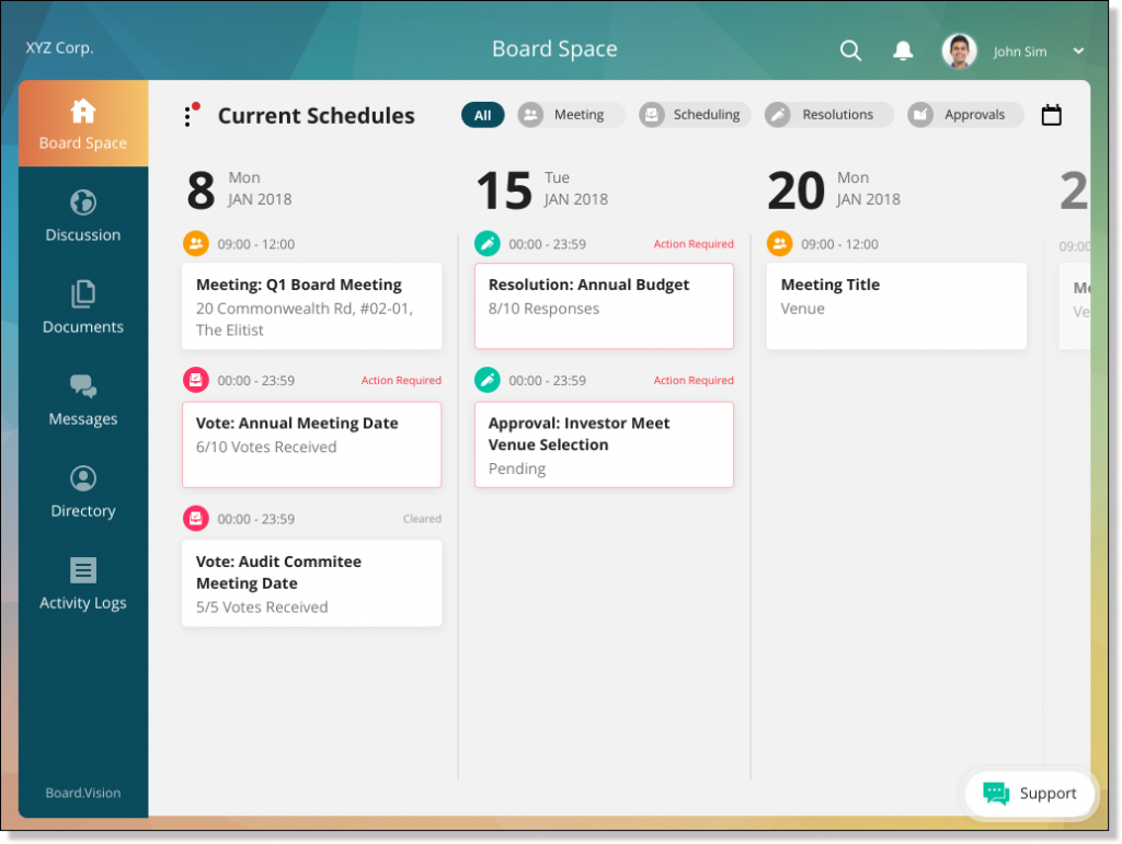
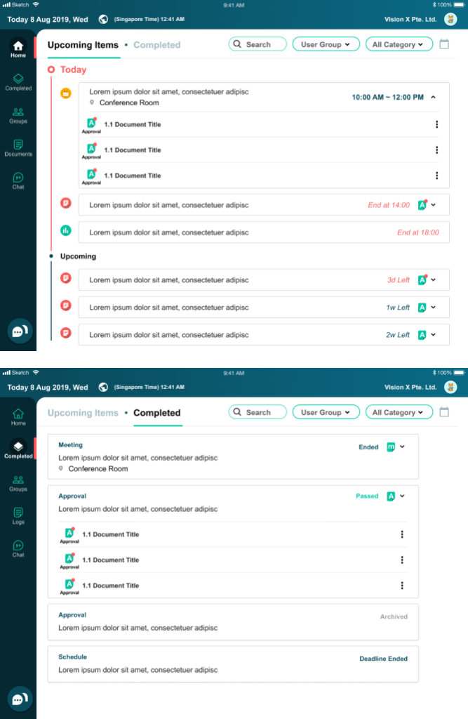
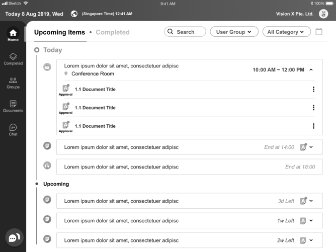
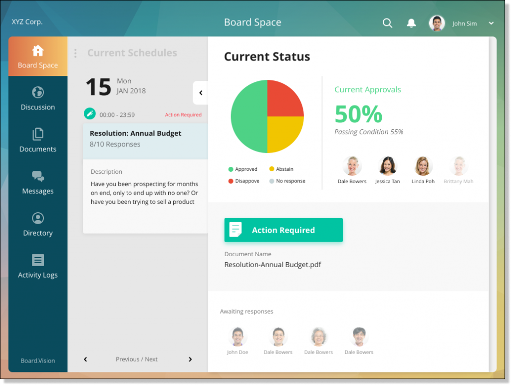
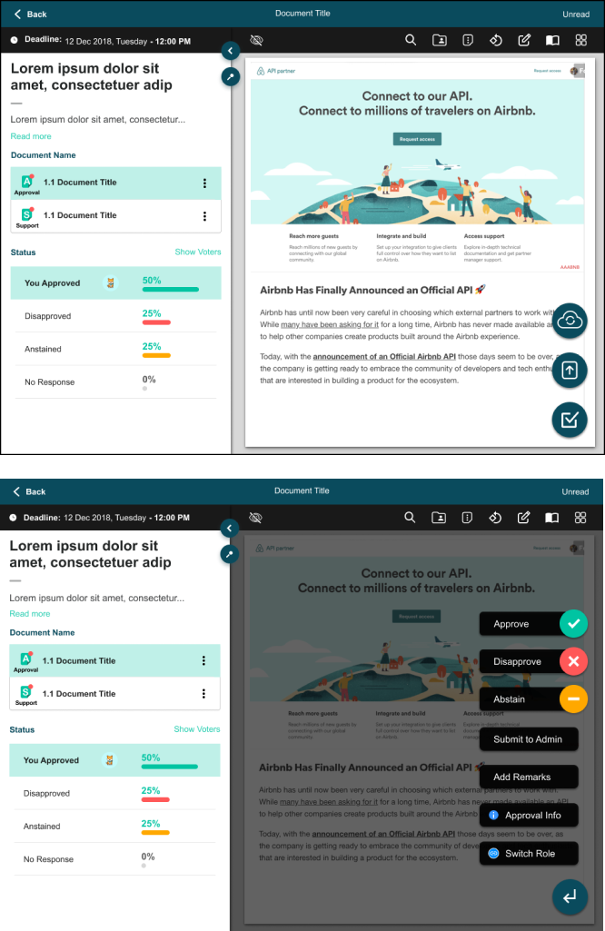
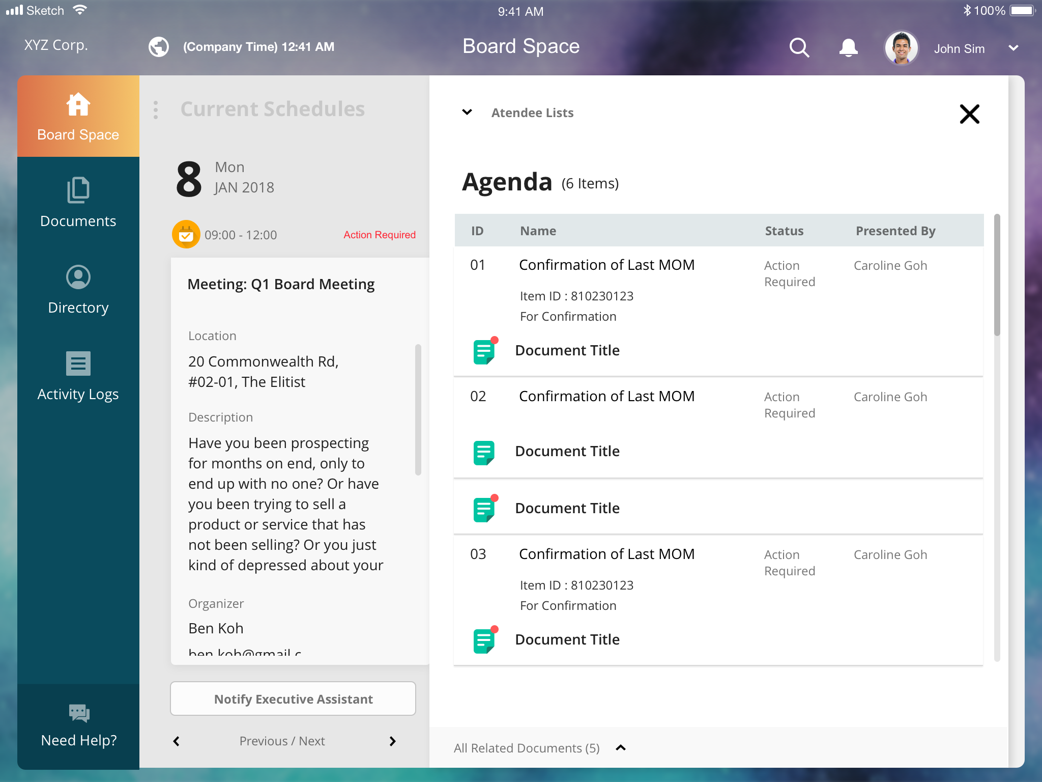
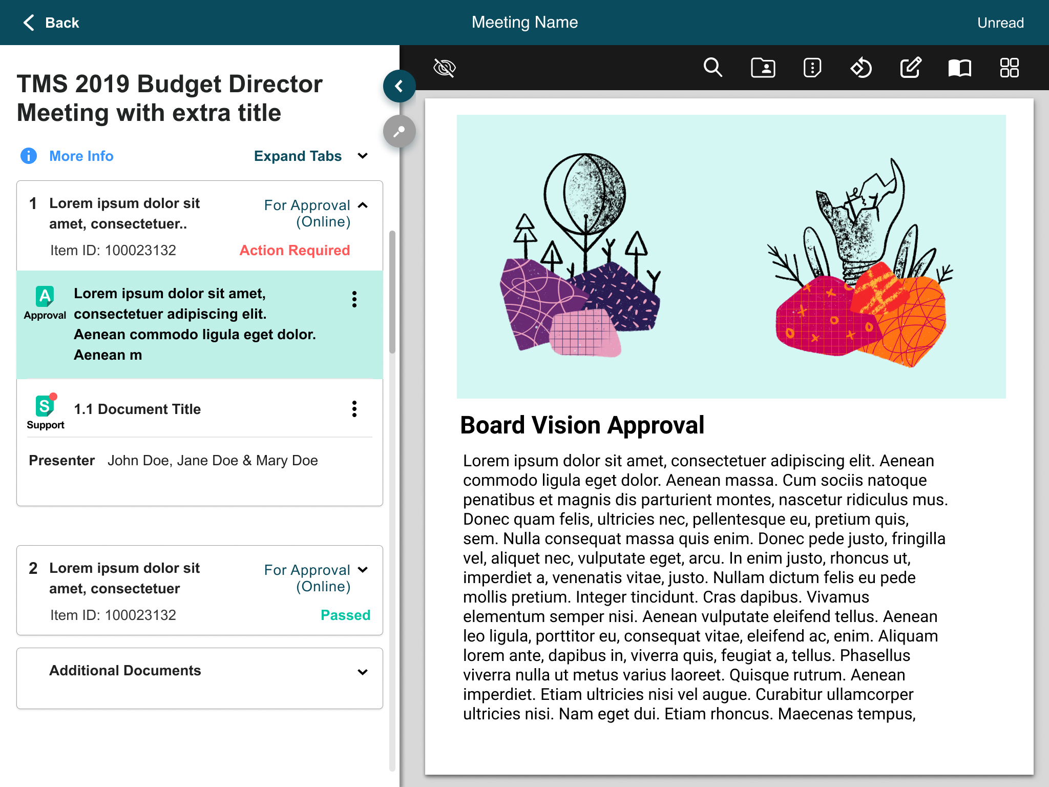
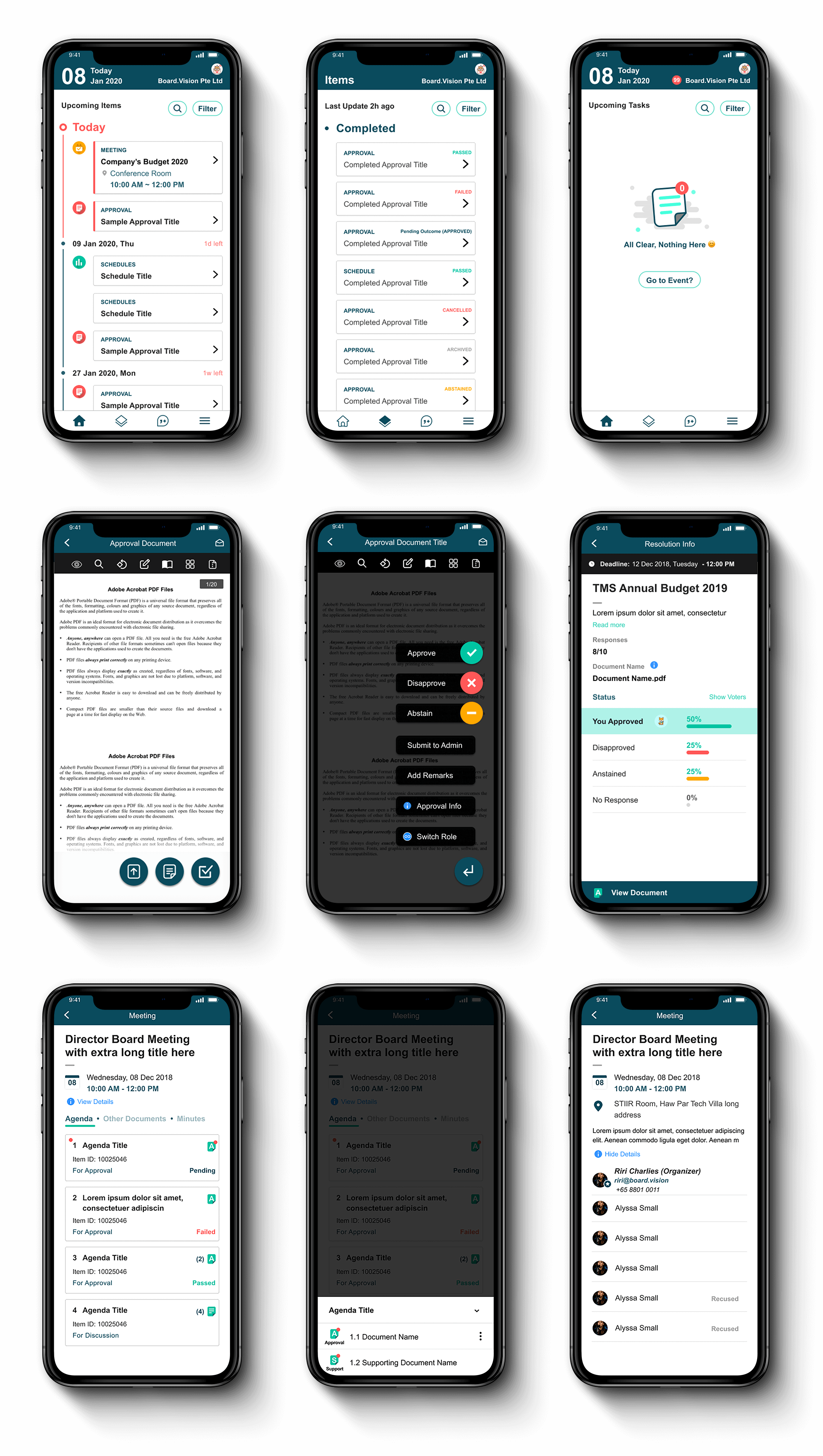
By talking to one of their personal assistants, I was able to find out the most important point of their goal in the app.

“They just want to see what they have to see(signature required documents), they only are using this app once in a while, it is not your everyday app.”

Key Features

These are the four key features are designed to improve user experience by boosting legibility and minimise the frictions in user journey.

Feature 1

Timeline Dashboard

Feature 2

Document Review

Feature 3

Meeting Scheduling

Feature 1

Timeline Dashboard

Problem Statment

As a business user, I want to see all my meetings and documents that require my attention first.

Opportunity

  • A chronologically listed items for meetings, documents for ease of the users’ workflow

Before

  • A messy layout with both horizontal and vertical scrolling. 
  • Not optimised for reading
  • Wasted real estate with unnecessary UI
  • Bad colour contrast

After

  • A hierarchical layout is introduced.
  • Urgency is marked in red and bigger fonts. 
  • Minimised the friction by using accordion and grouping same items together
  • Colour contrast is introduced

Contrast Test

Feature 2

Document Review

Problem Statment

As a business user, I want to see all my meetings and documents that require my attention first.

Opportunity

  • A chronologically listed items for meetings, documents for ease of the users’ workflow

Before

  • A messy layout with both horizontal and vertical scrolling. 
  • Not optimised for viewing, for instance, dates has the biggest font while all the important information like document and meeting names are buried
  • Wasted real estate with unnecessary UI

After

  • Less friction
  • Action buttons are grouped together for user-friendliness
  • A more intuitive layout
  • User can view and switch multiple documents with ease now

Feature 3

Agenda Discussion

Problem Statment

As a business user, I want to see all my meetings and documents that require my attention first.

Opportunity

  • A chronologically listed items for meetings, documents for ease of the users’ workflow

Before

  • Multiple layers of friction to view a document
  • Information overwhelming
  • Unable to view multiple documents simultaneously
  • Messy layout

After

  • Now able to view documents and details side by side.
  • Able to switch documents instantly.
  • Full view mode to read documents.
  • Design consistency

Mobile UI

In the revamp process, we have been using mobile-first approach as the starting point, then we expand it into a bigger screens with additional functionalities.

Design System

Board.Vision design system is focused to create a better legibility, visibility and less friction.

Some inspiration are taken from real life concept such as traffic light colour in hope it can guide older users to complete their tasks.

Admin Platform

Admin platform is the enterprise tool built for co-secretaries to manage shareholders infromation.

• • •

Looking for a designer?

Product Designer / Illustrator